





Welcome into my creative studio. I wanted to take you behind the scenes of my Burgundy stock images and share how this collection came together: the inspiration, the experimentation, and the many decisions that happen before an image makes the final cut.
When you see a finished collection, it can look as though all those beautiful images simply fell into place. Behind the scenes, there is a lot of creating, comparing, refining, and letting go. One of my favorite parts is building a visual world around a particular feeling, and Burgundy gave me so much to explore.
The result is the Burgundy Stock Image Collection: 110 curated, AI-generated images for creative entrepreneurs and brands drawn to rich color, warmth, and editorial detail. Here is a closer look at the thinking behind it.
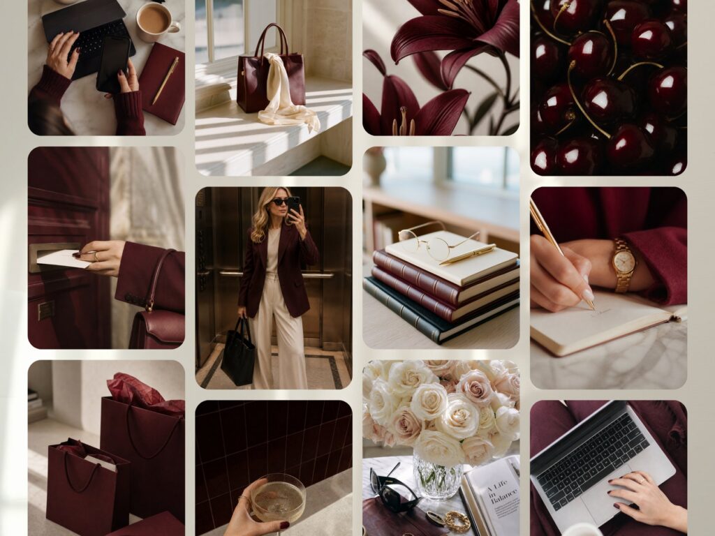
Why I chose burgundy for this stock image collection
Burgundy has so much personality. It can feel romantic, warm, intimate, moody, or sophisticated. Depending on the styling, it can also feel playful and fashion-forward. When I think about this color, I think of cherries, wine, chocolate, and beautiful textures you almost want to reach out and touch.
I have also been noticing how brands draw inspiration from food, flavor, and sensory experiences. A beauty campaign can create an entire feeling around a product, and that kind of visual storytelling inspired me here.
I wanted the color to feel distinctive without overwhelming every image. Sometimes a burgundy sleeve, a chair, or a small accessory is enough to make a scene feel richer. That subtlety gives the collection room to work alongside an existing brand palette.
Finding inspiration and making it my own
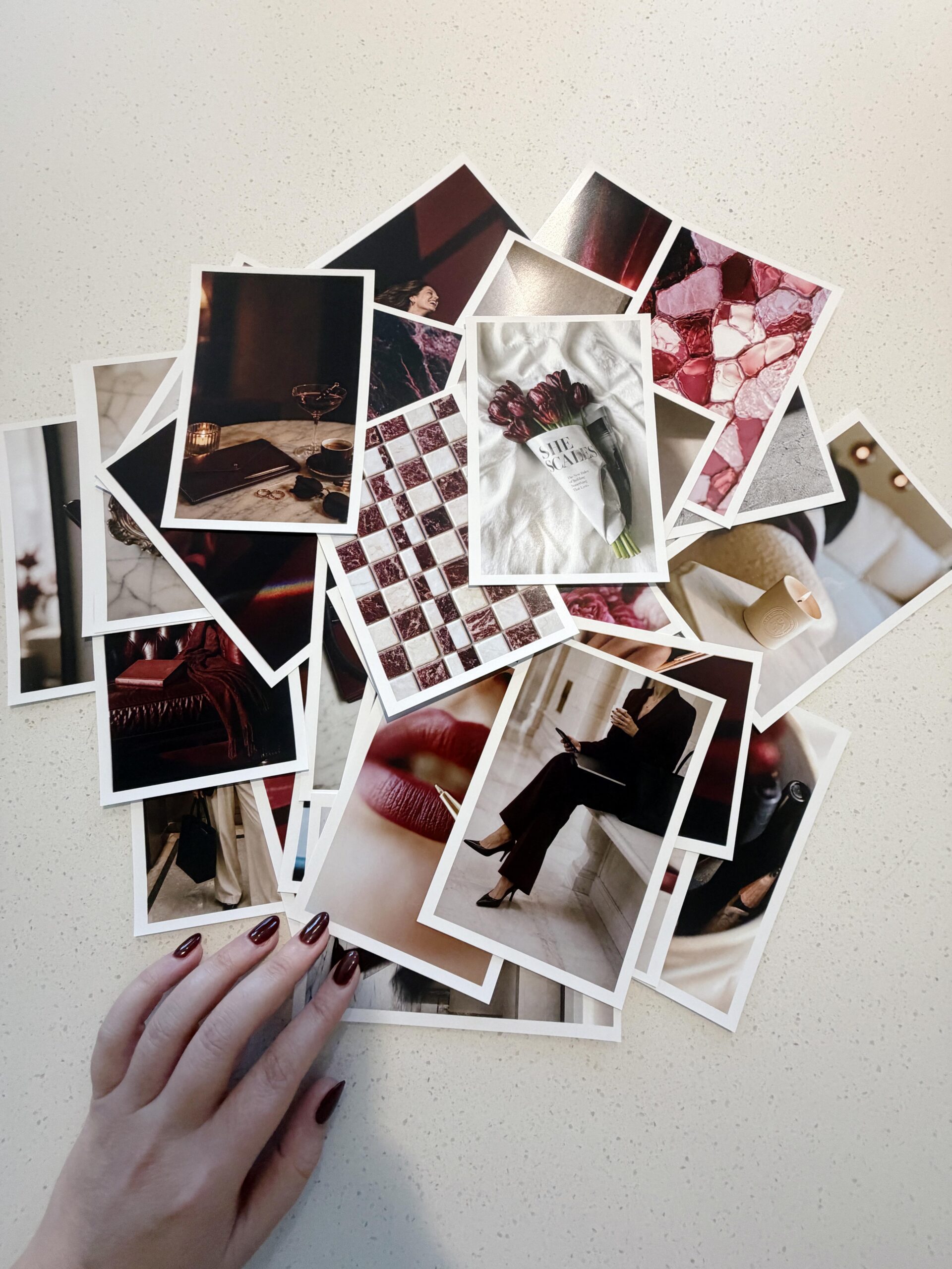
My process usually begins with research. Pinterest is one of my favorite places to explore color combinations, fashion, interiors, branding, and lifestyle imagery. For Burgundy, I kept noticing the color in accessories, furniture, and everyday objects.
As I save inspiration, I pay attention to what makes each image appealing. Is it the lighting? The composition? A particular combination of textures? I am looking for ideas I can develop into something of my own, rather than recreating an image I have saved.
At this stage, I try to keep the board open and varied. Different scenes, settings, and perspectives help me imagine what could belong together. The more precise creative direction grows out of that foundation.
How we create AI stock images with creative direction
Once the direction starts to take shape, we move into image creation. We use detailed prompts and pay close attention to lighting, composition, camera angles, realism, and mood. This is where the experimentation really begins.
AI can produce beautiful results, but the first result is rarely the end of the process. An image might look lovely at a glance and then feel artificial when I look more closely. Sometimes the surface is too smooth, the styling is too polished, or the composition misses the feeling I wanted.
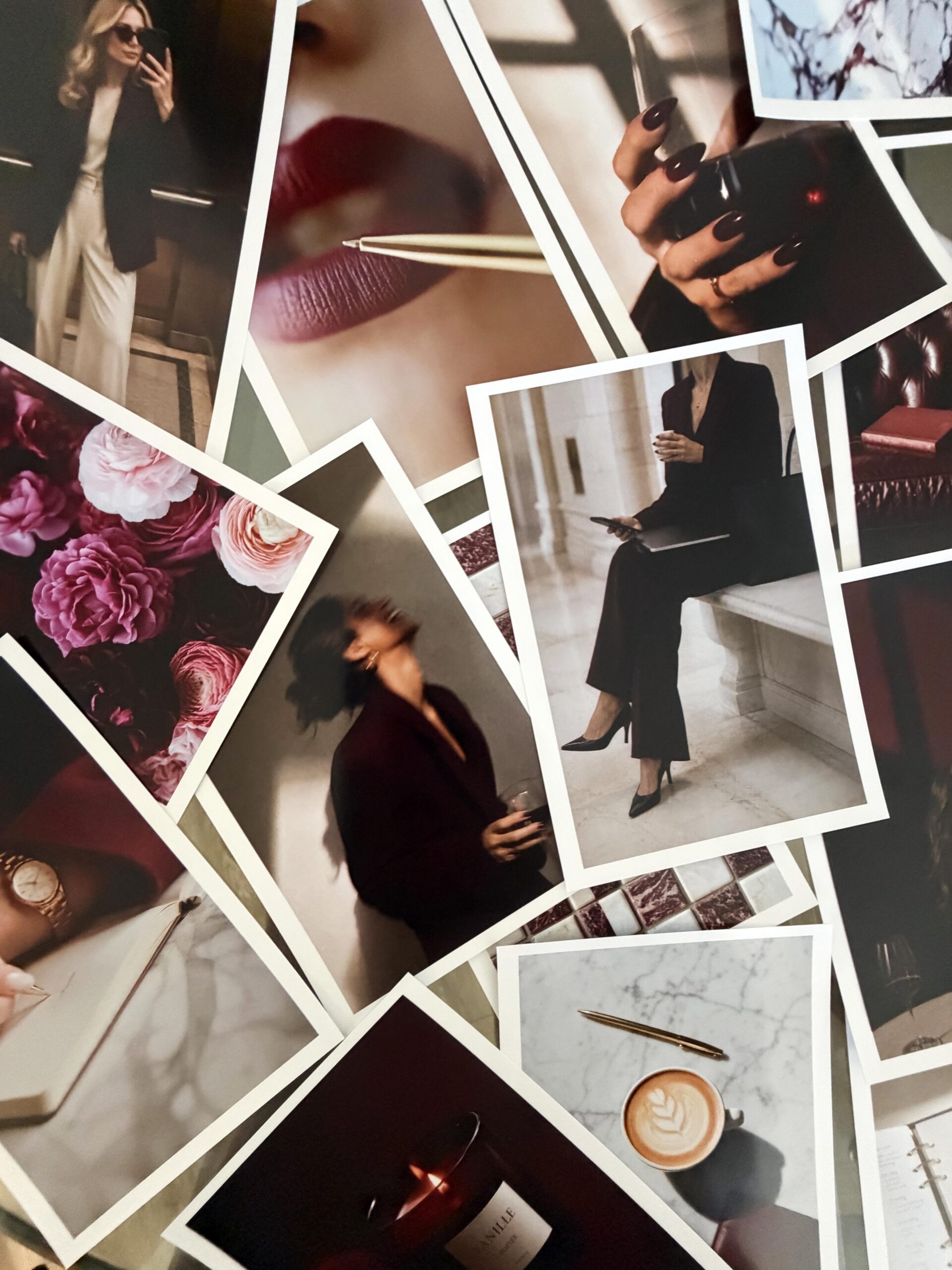
For Burgundy, we generated thousands of images. Those initial images became the material for the next stage: reviewing, organizing, comparing, and deciding what belonged in the collection. If you are curious about that process, I share more in how we create AI images that look real.
The hardest part: choosing between beautiful images
Choosing the final images is often the hardest part. When several variations are beautiful, it is tempting to keep them all. But as a designer and business owner, I know that too many similar options can make a simple decision feel overwhelming.
Imagine one flat lay with a wallet, keys, a scrunchie, a phone, and a coffee cup. Now imagine another with just the scrunchie and coffee. I would often choose the second. It still suggests a moment, but it leaves more room for your own story.
That flexibility matters. Someone at a desk with coffee could support an article about entrepreneurship, a newsletter about creative routines, or a post about slowing down. Your words give the image its context.
I also think about where these images will live. Website banners, email headers, blog graphics, and Instagram posts often need space for typography. I look for enough detail to make an image interesting, with enough breathing room for a message to sit comfortably alongside it.
What makes the final cut?
- A clear mood: the image feels connected to the collection.
- Useful composition: it can support a layout, a crop, or text.
- Natural detail: textures and lighting feel believable.
- A distinct purpose: it adds something beyond another near-duplicate.
Why some images do not make it into Burgundy
An image can be beautiful and still feel out of place. If I already have several desk flat lays telling a similar story, another one may add very little. A new scene or perspective can give the collection more range.
I am also careful about realism. Food can be especially tricky in AI imagery: plastic-looking surfaces and strange glowing edges can slip into an otherwise appealing composition. I prefer texture, personality, and natural imperfection.
The same care goes into the overall setting. A quiet beach scene might be lovely on its own, but it could feel disconnected from a collection built around city life and interiors. Every choice has to make sense within the larger visual world.
Creating variety while keeping the collection cohesive
Cohesion should still leave room for surprise. I want you to be able to reach for different Burgundy stock images without feeling as though you are using the same scene over and over.
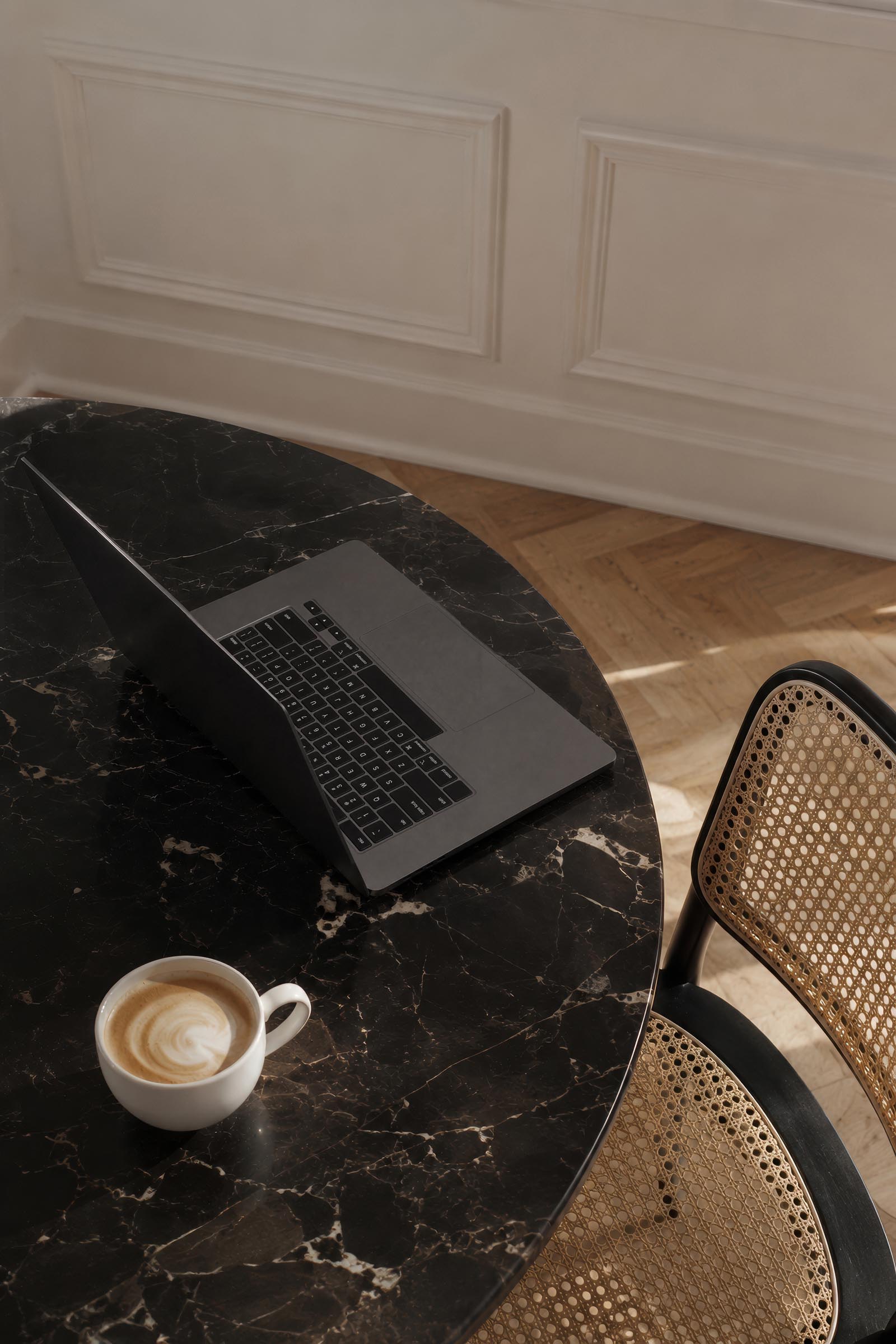
That means considering the mix of workspaces, people, close-up details, interiors, and everyday moments. A vintage burgundy telephone can bring a different kind of personality than a modern laptop scene. Both can belong to the same collection when their color, light, and mood feel connected.
Those unexpected images are part of the fun. You might not know exactly how you will use one at first, then find the perfect place for it in a story or campaign.
How to use burgundy stock images in your brand
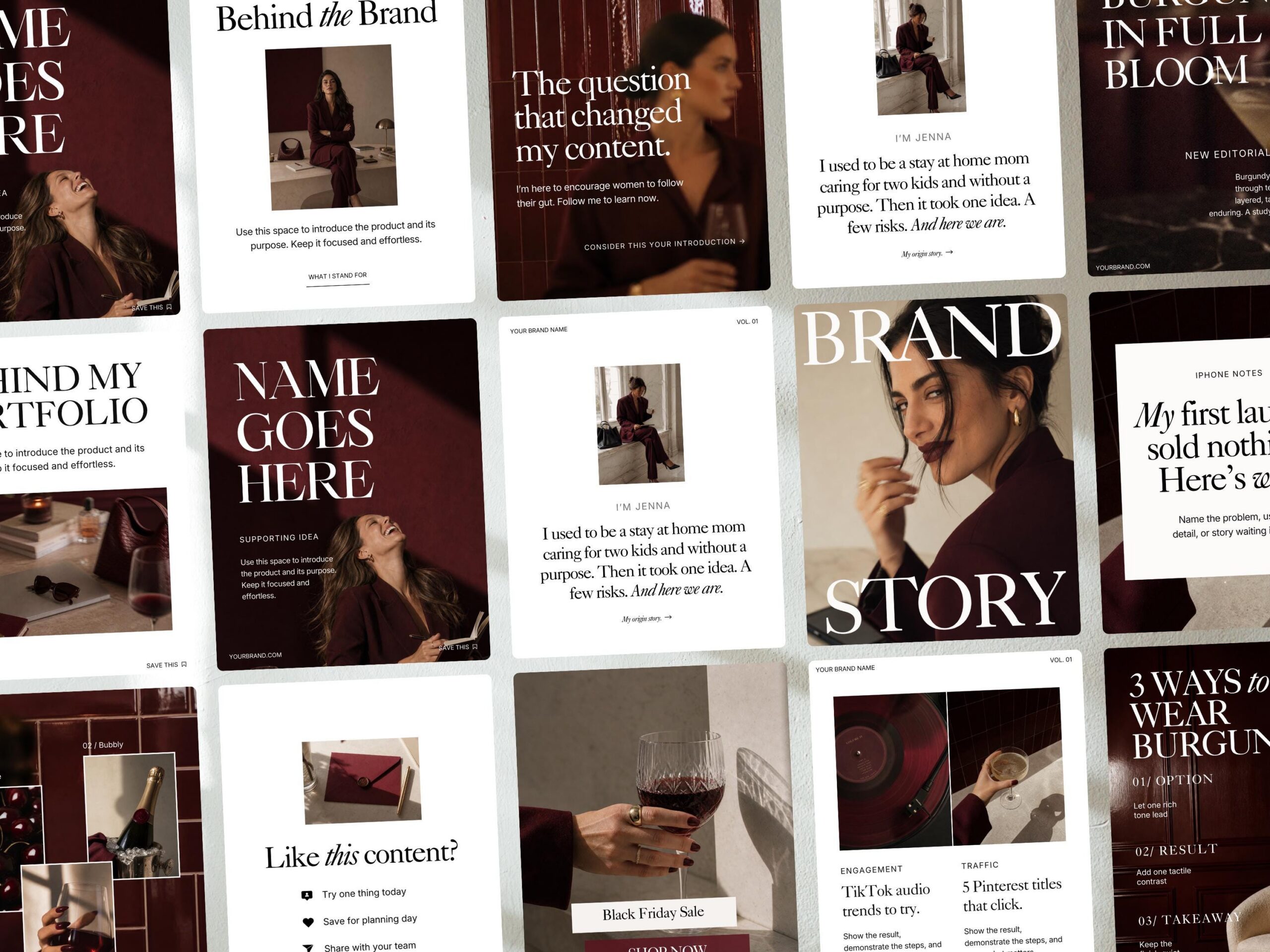
You do not need to change your whole brand to use this collection. Burgundy can become a visual foundation or a small accent alongside your own photography and existing assets. Start with the feeling you want your content to communicate, then choose an image that supports it.
- Website pages: add warmth through an editorial detail or workspace image that fits your message.
- Instagram posts: pair a simple composition with your own typography, captions, and brand colors.
- Email newsletters: use a quiet lifestyle moment to introduce a story, routine, or update.
- Blog content: choose imagery that supports the subject while leaving room for your headline.
- Seasonal campaigns: bring in richer tones for fall and the holidays, or use a subtle accent throughout the year.
For more ideas, explore my guide to five practical places to use stock photos in your business.
Your brand still needs your point of view
AI is an exciting creative tool, especially for small businesses and entrepreneurs. But there still needs to be a person deciding what feels right, what is appropriate, and what serves the business. That is why creative direction and curation matter so much to me.
I see stock imagery as a complement to your personality, your own photography, and the ideas that make your business yours. Use it thoughtfully. Choose the images that help you communicate, and let your own voice guide how they appear in your content.
Seeing an initial idea grow into a collection is one of my favorite parts of this work. I hope this look inside the making of Burgundy helps you see the care behind each selection, and gives you a few ideas for making the images your own.
Ready to explore the collection? Browse the Burgundy Stock Image Collection and find the scenes and details that fit your brand.


If you want to elevate your graphic design game, enjoy talking about small business entrepreneurship, and appreciate a spark of inspiration mixed with authenticity...You've come to the right place.
Follow
Let's be social →
Join
Join the newsletter →