
")


If you’ve ever downloaded a beautiful collection of stock photos only to let them sit untouched in a folder, you’re not alone.
I see it all the time.
Not because people don’t like the images.
Not because they don’t have good intentions.
But because they’re simply not sure where to use them.
When you’re building a business, it’s easy to think you need a complete rebrand before your brand can feel more polished. A new website. New messaging. A new Instagram strategy.
The truth is that you can make substantial enhancements with a few small visual updates.
Before you redesign your website or spend months reworking your brand, start here.
These are five simple places I regularly use stock photos in my own business to create a more cohesive, professional, and elevated brand experience.
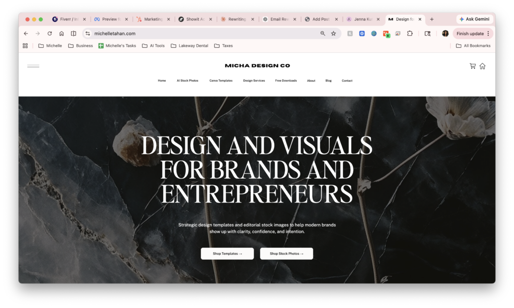
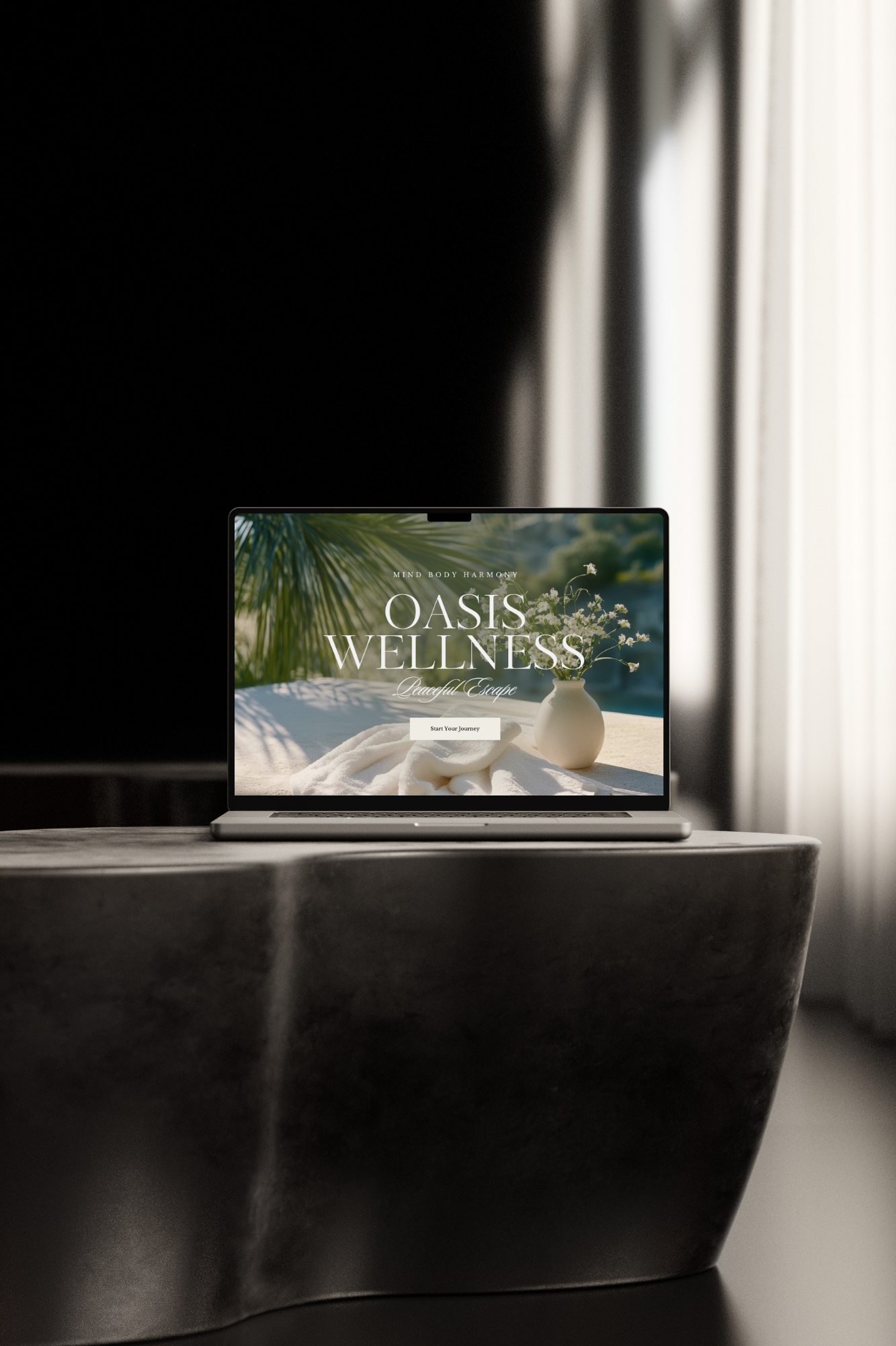
1. Your Website Homepage Header
If I could only make one update to a website, this would be it.
Your homepage header is often the first thing visitors see, making it one of the fastest ways to elevate your brand online.
Choose an image with texture, contrast, or negative space and use it as the background of your hero section. Then overlay your headline and call-to-action button on top.
These are the types of images that work best:
- Textured images (stone, linen, paper, abstract details)
- Editorial images (workspaces, interiors, lifestyle moments)
- Images with balanced lighting and enough negative space for text
Quick Tip: Add a dark overlay to the image at 20–40% opacity and use white text on top. This creates contrast and makes your headlines easier to read.
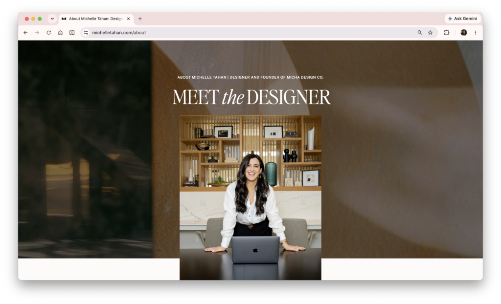
2. Your About Page
My favorite way to use stock images is alongside real photography to create a polished, personal, and elevated look.
I do not recommend replacing your professional headshots with stock images. Instead, pair them together to create layering, depth, and visual interest.
Some simple ways to do this:
- Place an abstract image behind your headshot
- Use moody, professional, or inspiring scenes between sections of your About page
- Incorporate stock images as visual dividers throughout the page
A stock image can add texture, color, and personality while keeping the focus on the person behind the brand.
Quick Tip: The key is to use stock images as supporting visuals, not replacements. Pair them with real photos to create a brand that feels both polished and human.
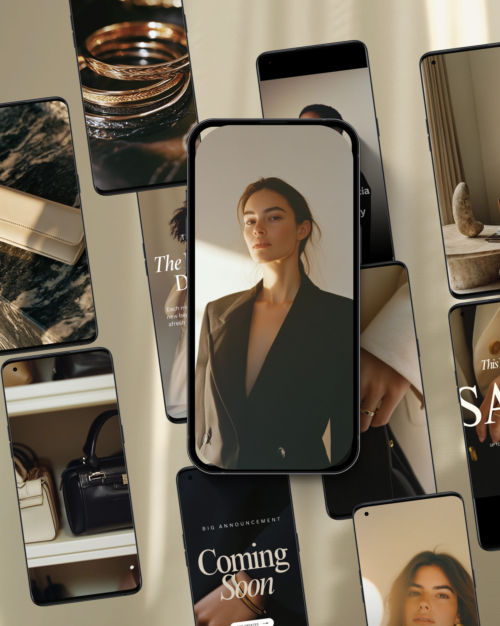
3. The Header or Footer of Your Next Newsletter
I firmly believe that great email content should do most of the heavy lifting.
That said, one or two intentional images in the header or footer can make your newsletters feel more polished, professional, and on-brand while keeping the focus on the content itself.
Some simple layouts I love:
- A full-width image with a headline overlay
- A faded image background behind a quote or announcement
- A smaller image paired with text in a two-column layout
Quick Tip: Resize and compress your images before uploading them. Large image files can slow load times and negatively impact the reader experience.
4. A Service Promotion Inside Your Email
This is one of the most overlooked uses for stock imagery.
If you sell services such as coaching, consulting, design, photography, strategy, virtual assistance, or any experience-based offer, stock images can help visually support what you’re promoting.
Create a simple two-column section:
- Image on one side
- Text and a button on the other
For example, if you’re talking about strategy, systems, productivity, or client work, a workspace image can help reinforce the message. The image doesn’t need to be literal—it simply needs to support the feeling and story you’re telling.
Quick Tip: Choose images that naturally complement the offer or message beside them. The strongest visuals feel connected to the story rather than randomly placed.
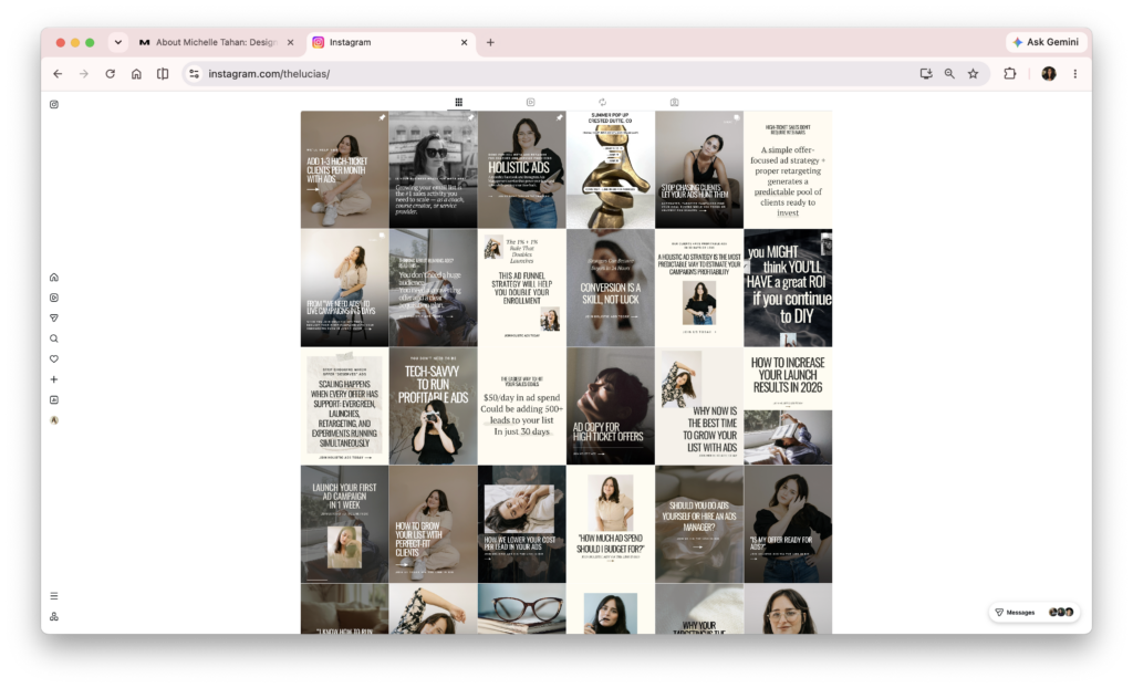
5. Instagram Carousel & Reel Covers
This is one of the fastest wins because most people already spend time creating content but very little time thinking about how their profile looks as a whole.
If you’re already posting consistently, adding stock images throughout your feed can instantly make your content feel more intentional, cohesive, and professional.
Since education is such a big part of content marketing, stock images can work beautifully even for content-heavy carousels and reels.
Choose an image, add a short title overlay, and use your brand fonts and colors.
Some examples:
- 3 Website Mistakes Costing You Leads
- What I Wish I Knew Before Starting My Business
- My Favorite Branding Tip
Quick Tip: If one cover is text-heavy, make the next one lighter and more visual. If one image is very dark, follow it with something brighter. This creates variety and helps your feed feel more intentional and easier to browse.
There you have it.
Five simple places to start using your new images today.
The goal isn’t to use every image right away.
It’s to slowly build a visual library that supports your content, strengthens your brand, and makes showing up online a little easier.
Small visual upgrades add up.
Before long, you’ll have a brand that feels more cohesive, more intentional, and more professional—without ever needing a complete rebrand.


If you want to elevate your graphic design game, enjoy talking about small business entrepreneurship, and appreciate a spark of inspiration mixed with authenticity...You've come to the right place.
Follow
Let's be social →
Join
Join the newsletter →