
")


If you’ve ever felt both inspired and a little unsure about how to use stock images, you’re not alone. You see all the beautiful imagery and start imagining how polished and elevated your website could feel — and then the practical question shows up:
Okay… how do I actually use these?
In this post, I’m going to help you answer that using a website example paired with our Aurea Stock Image Collection. Keep in mind, this is not a rigid rulebook or strict formula, but it is a guide to help you think about using stock photos intentionally.
Because the truth is, stock images are not meant to carry your entire website. When used well, they support your content, your message, and your layout. When overused or misplaced, they can do the opposite.
Below, I am walking through how I personally use stock images on websites to create an editorial, elevated feel without things feeling generic or overly stocky.
I have also recorded a video walkthrough where I scroll through a real homepage and explain these ideas in context. You can watch that here, and use the written sections below as a companion.
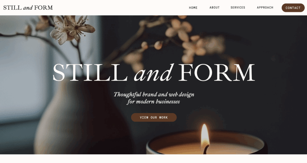
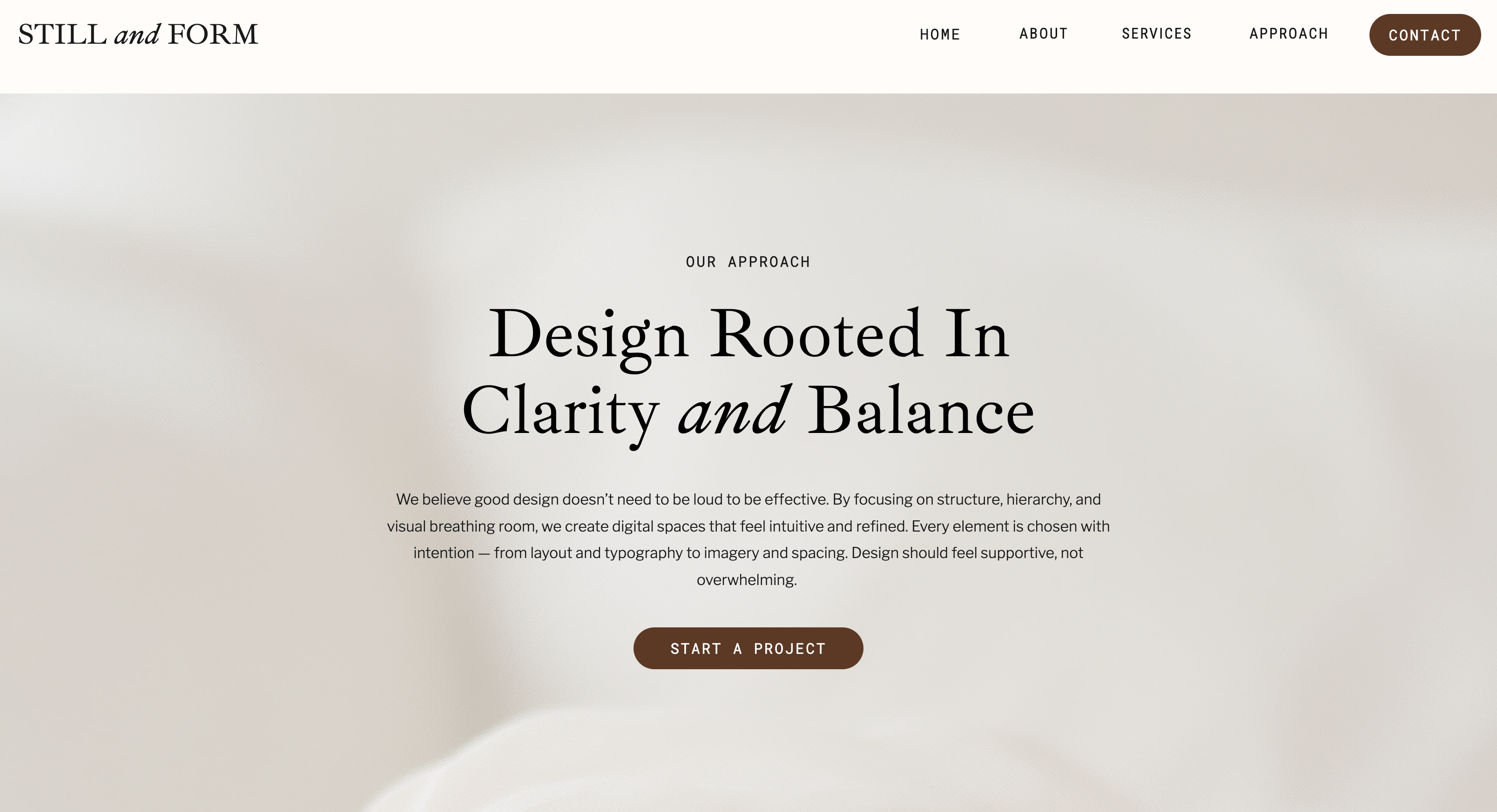
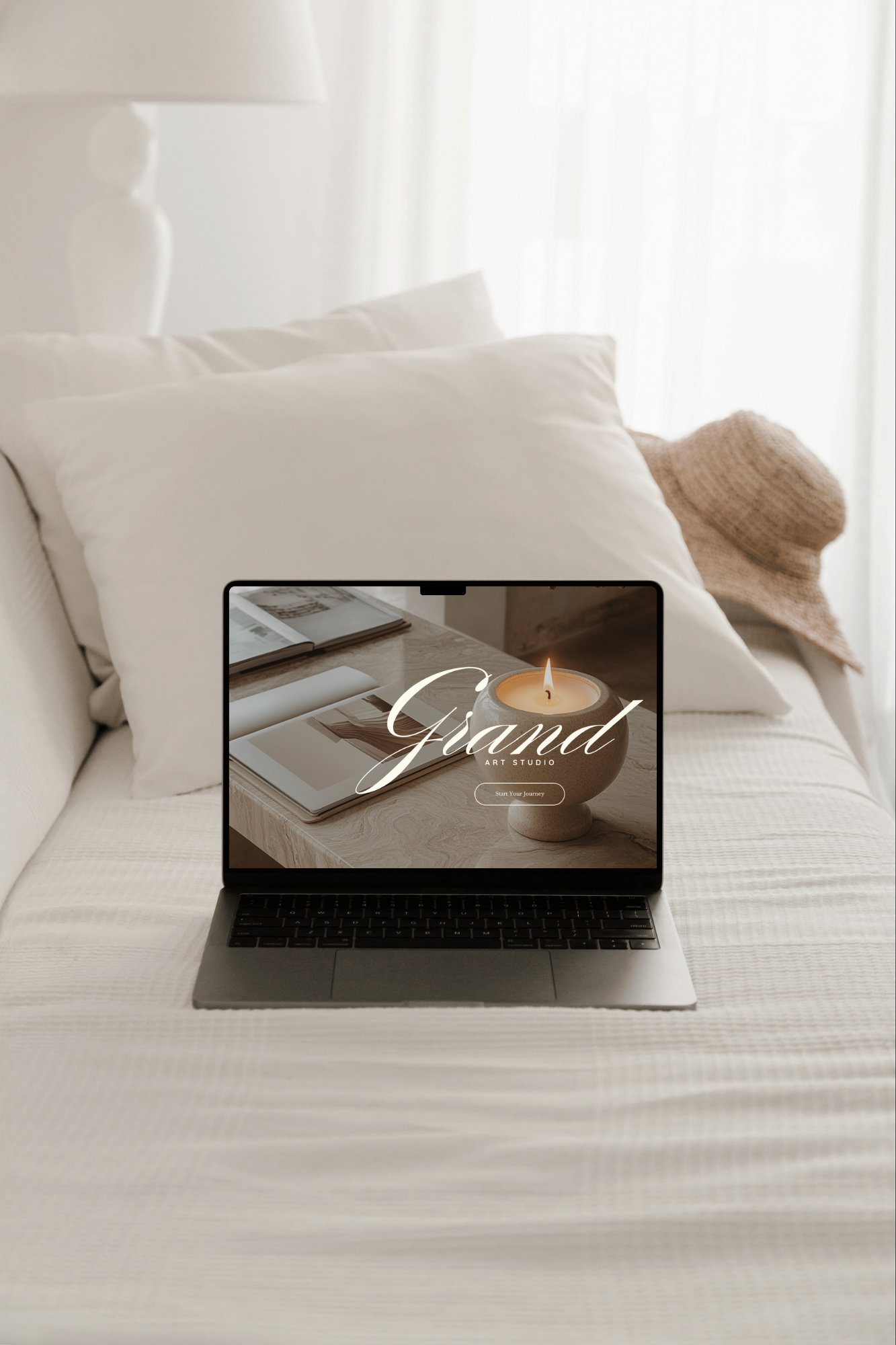
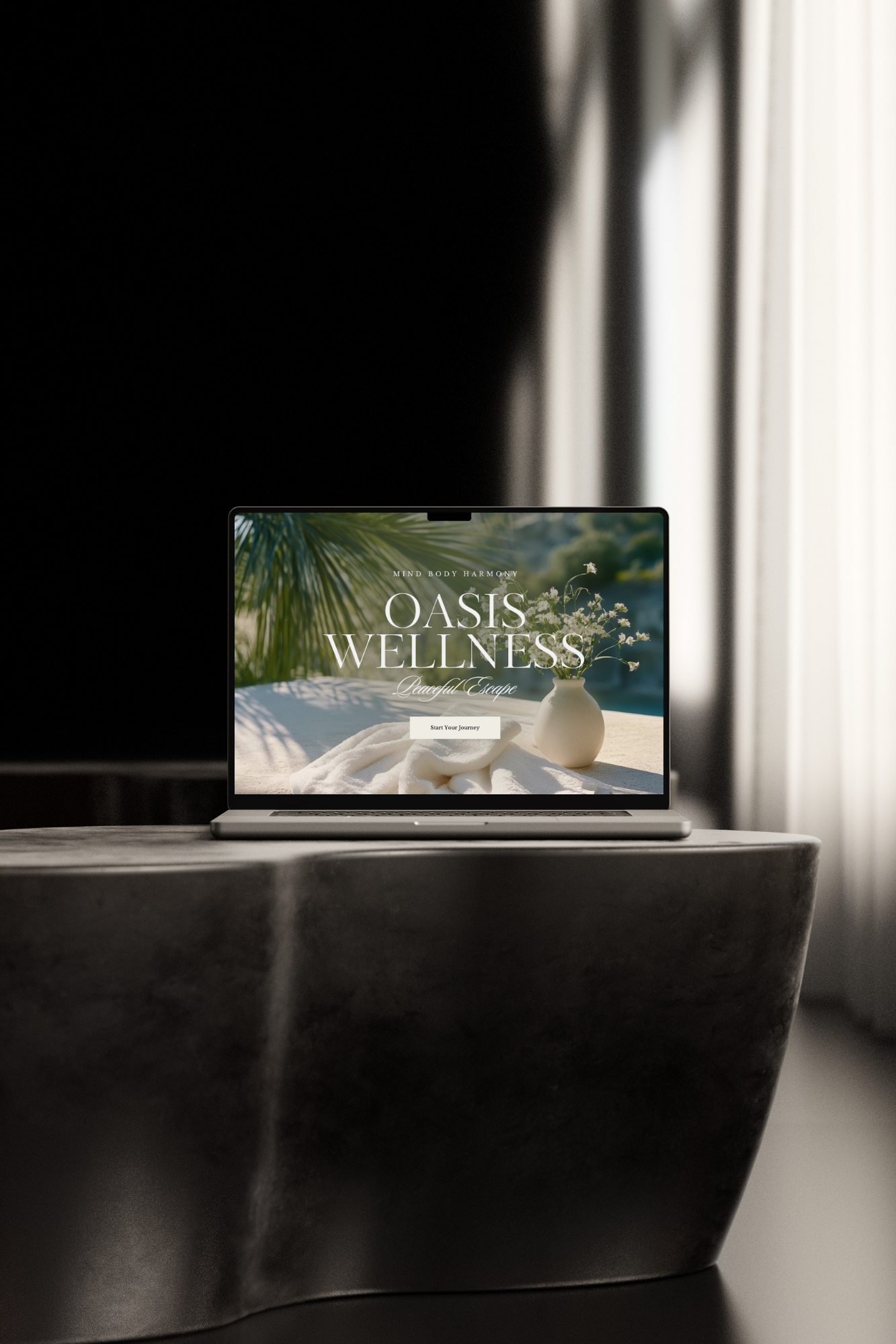
Using Stock Images in the Hero Section
Your hero section is the first place people land. It is the first impression, and yes, a stock image can absolutely work here. The key is knowing what to look for. When I choose a header image, I focus on these three principles: simplicity, relevance, and harmony.
Simplicity: A good hero image is not overly busy or detailed. It leaves visual breathing room so your headline remains clear and readable.
Relevance: The image does not need to tell your entire story. However, it should relate on some level to your brand’s visual aesthetic, and what you offer.
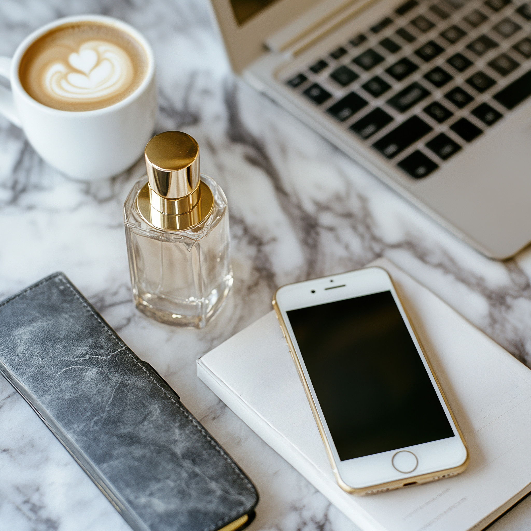
Tip: Images with general and everyday objects, what I like to call context images or foundation images, often work beautifully (think intuitive desks, devices, decor, and workspaces). They are professional, flexible, and easy to pair with messaging without being overly specific.
Harmony: Finally, the image should feel harmonious with the rest of your design. It should work with your color palette, typography, and layout rather than compete with them.
The role of a hero image is to set the tone, not explain everything.
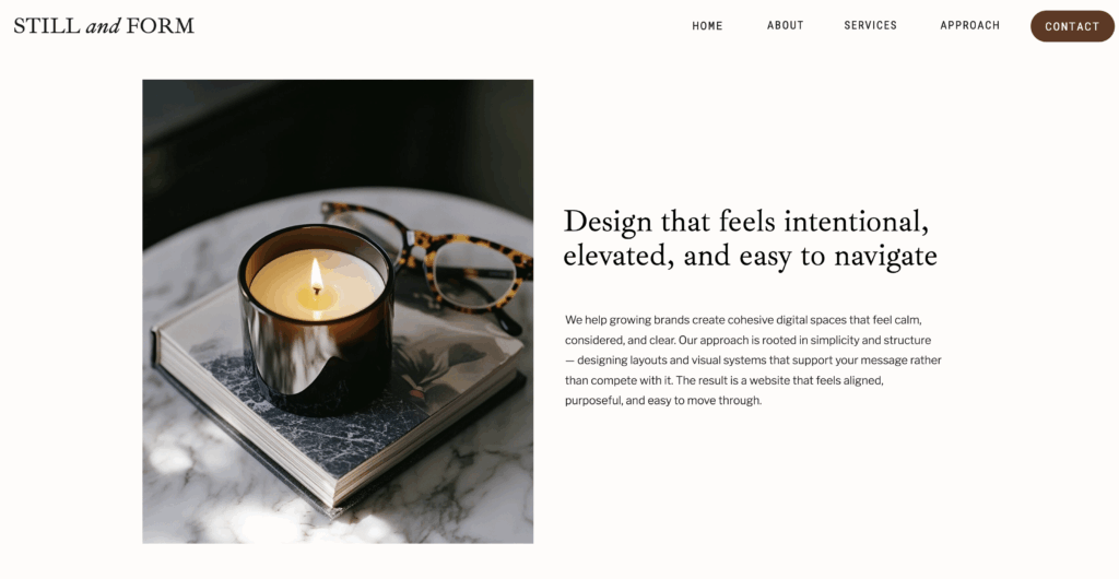
Supporting Content with Images Instead of Replacing It
One of my favorite ways to use stock images is alongside beautiful and impactful text. A gorgeous and useful image paired with powerful words is truly editorial.
When images are placed next to clear headings and paragraphs, they help break up content visually while allowing the words to do the heavy lifting. This is where stock images shine, as supporting elements that add warmth, balance, and rhythm.
Images that feel neutral and relatable are especially useful here. They are flexible, easy to reuse across layouts, and do not distract from the message you are trying to communicate. Think of these images as visual pauses, not explanations.
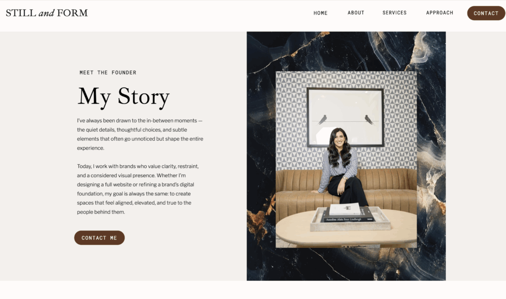
Where Real Photos Matter Most (Don’t Use Stock Here)
There are places on a website where stock images simply are not the right choice. About sections, personal stories, and trust-building moments should feature real photos of you. This is where connection happens.
That said, stock images can still play a role here when used thoughtfully. Pairing a real image with a subtle stock image in the background, as a border, texture, or framing element, can add depth and character without replacing authenticity. I love adding textural stock images behind a real image.
The contrast between real photography and stock imagery actually makes both feel more intentional.
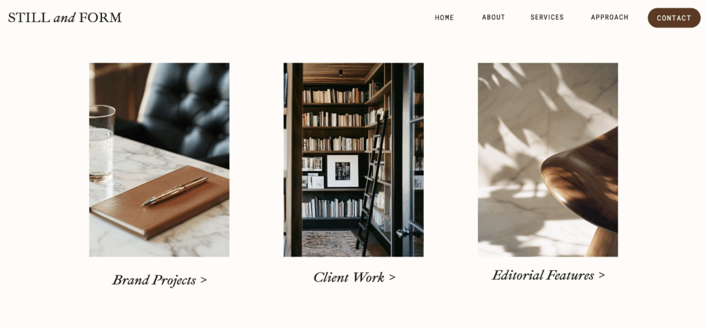
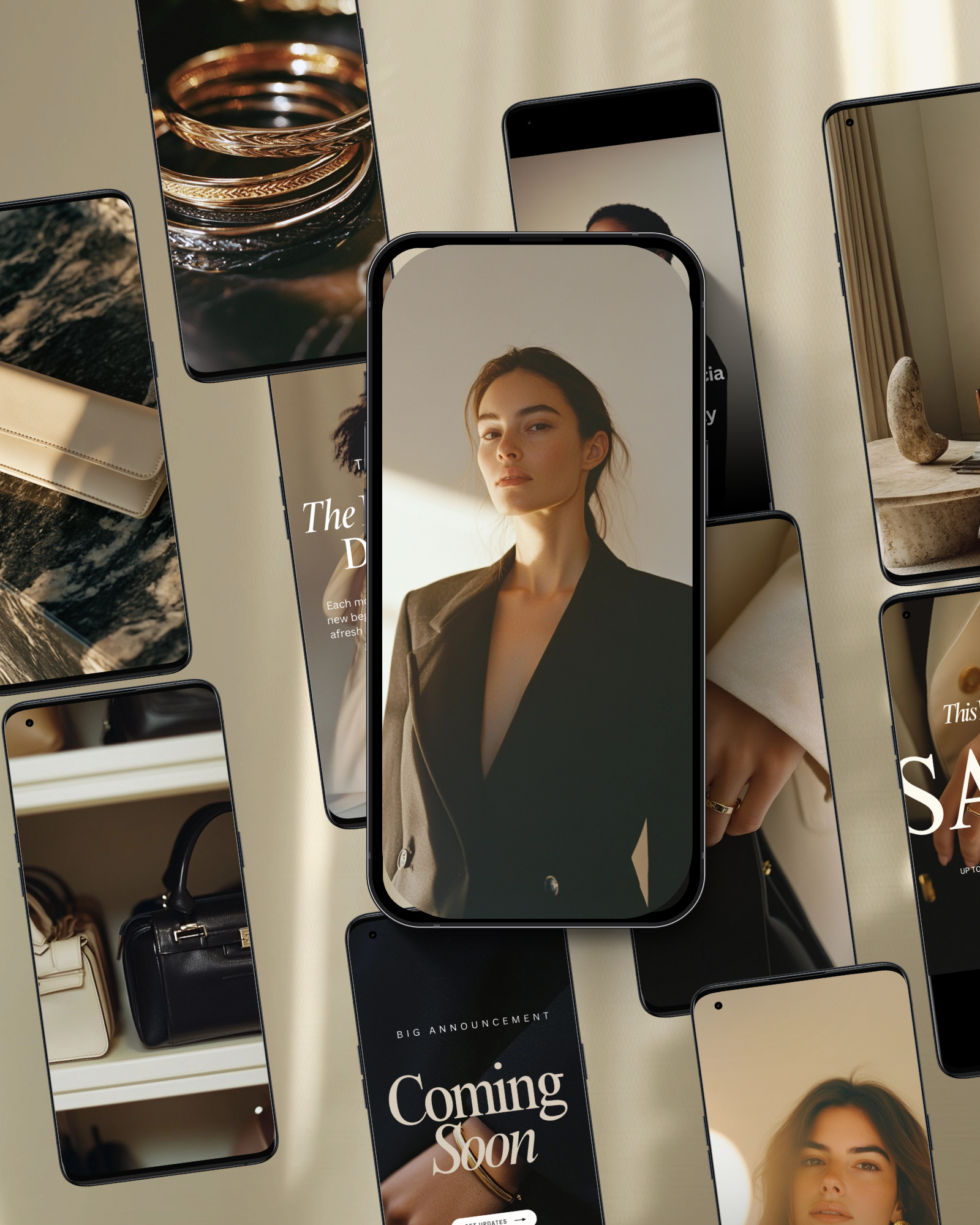
Using Stock Images for Services, Benefits, or other Lists
As mentioned above, especially for product-based businesses, real product photos are essential. However, for service-based businesses, stock images can be incredibly effective to pair next to your services when used with intention.
In service sections, I like to line up a curated set of cohesive images that share a similar color palette and mood. Mixing close-ups, wider shots, and textures keeps the layout visually interesting without feeling chaotic or repetitive. You can apply this same method to other lists like like benefits or processes.
When images serve the same role across a layout rather than each trying to stand out, they create rhythm and consistency. Also, make sure to include enough white space between a set of multiple images. This is how you can use multiple stock images without overwhelming the page.
Subtle Image Behind Color Overlay
Not every stock image needs to be 100% visually seen. Some of the most effective uses are subtle, where an image functions almost like a background texture. Layered over a base color, these images add depth and mood while keeping text crisp and readable. I love using images this way because it adds so much depth and interest.
Tip: Set the image opacity (how transparent the image is) to 20% or 30% and a color gradient on top. Then, add text on top. This is a very common method I use when laying out web pages.
In these cases, the text still leads the experience. The image simply enhances it. This is a beautiful way to add dimension without doing too much.
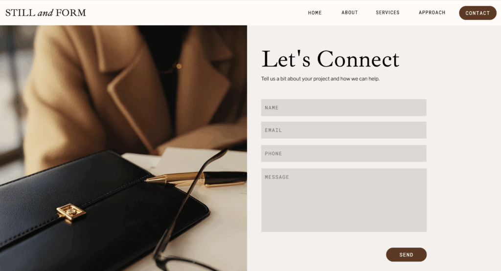
Images for Contact Forms, Email Sign Ups, and other Functions
Even practical areas of a website, like contact forms, newsletter sign ups, webinar registration, and other functional purposes can benefit from thoughtful imagery.
A subtle image can add warmth and visual interest while keeping the form itself clear and easy to use. When done well, the image supports the experience without interfering with usability.
Again, the image is not the focus. It is there to make the interaction feel more human and inviting.
The Big Takeaway
At the end of the day, stock images work best when they’re used quietly and intentionally. They’re not meant to explain your business or replace real connection. They’re there to support the experience, create flow, and make your content feel more polished and cohesive.
If you’d like to see these ideas in action, I walk through this entire homepage step by step in the video above and explain why each image was placed where it is.
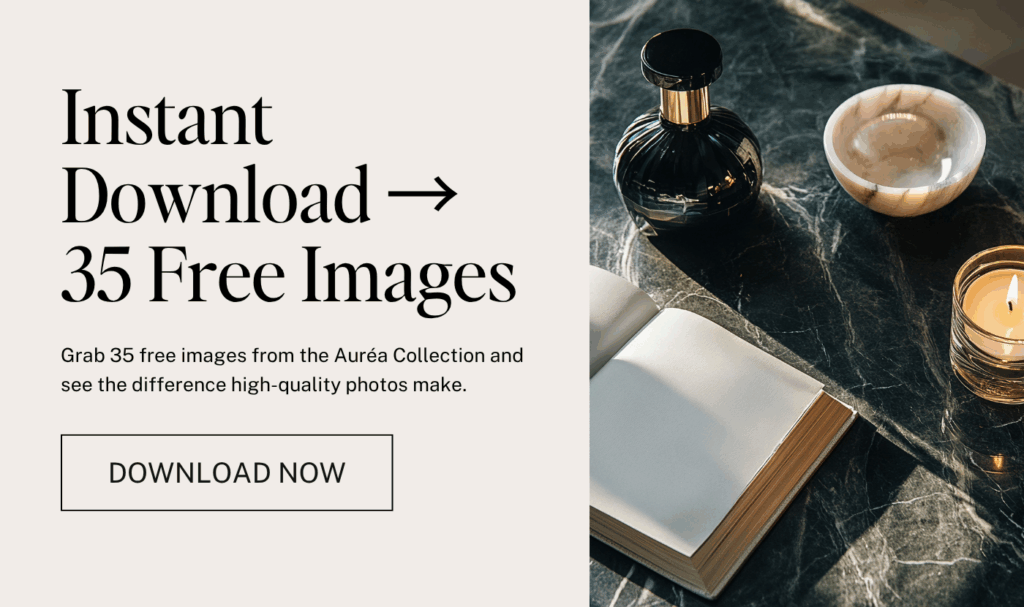
If you love the images you see here and want to try using them in your own layouts, you can download my Auréa free stock image bundle. It’s a great way to test placements, experiment with flow, and see how intentional imagery can elevate your site.


If you want to elevate your graphic design game, enjoy talking about small business entrepreneurship, and appreciate a spark of inspiration mixed with authenticity...You've come to the right place.
Follow
Let's be social →
Join
Join the newsletter →