
")


Brooklyn did not start as a design idea. It stemmed from the question of, “How can I create strategic posts that actually help entrepreneurs figure out what to say on their platform?”
I spent time studying brands that consistently show up with authority. Not posting randomly, but founders and entrepreneurs who have thoughtful insights to share. Whether that’s providing education, sharing perspective, communicating their services clearly, or building trust through their own words. I analyzed the common patterns in how they structured their posts, how they presented their ideas, and how they balanced education, storytelling, and promotion without feeling scattered.
After analyzing posts from different brands and studying the audience engagement, I noticed some common themes:
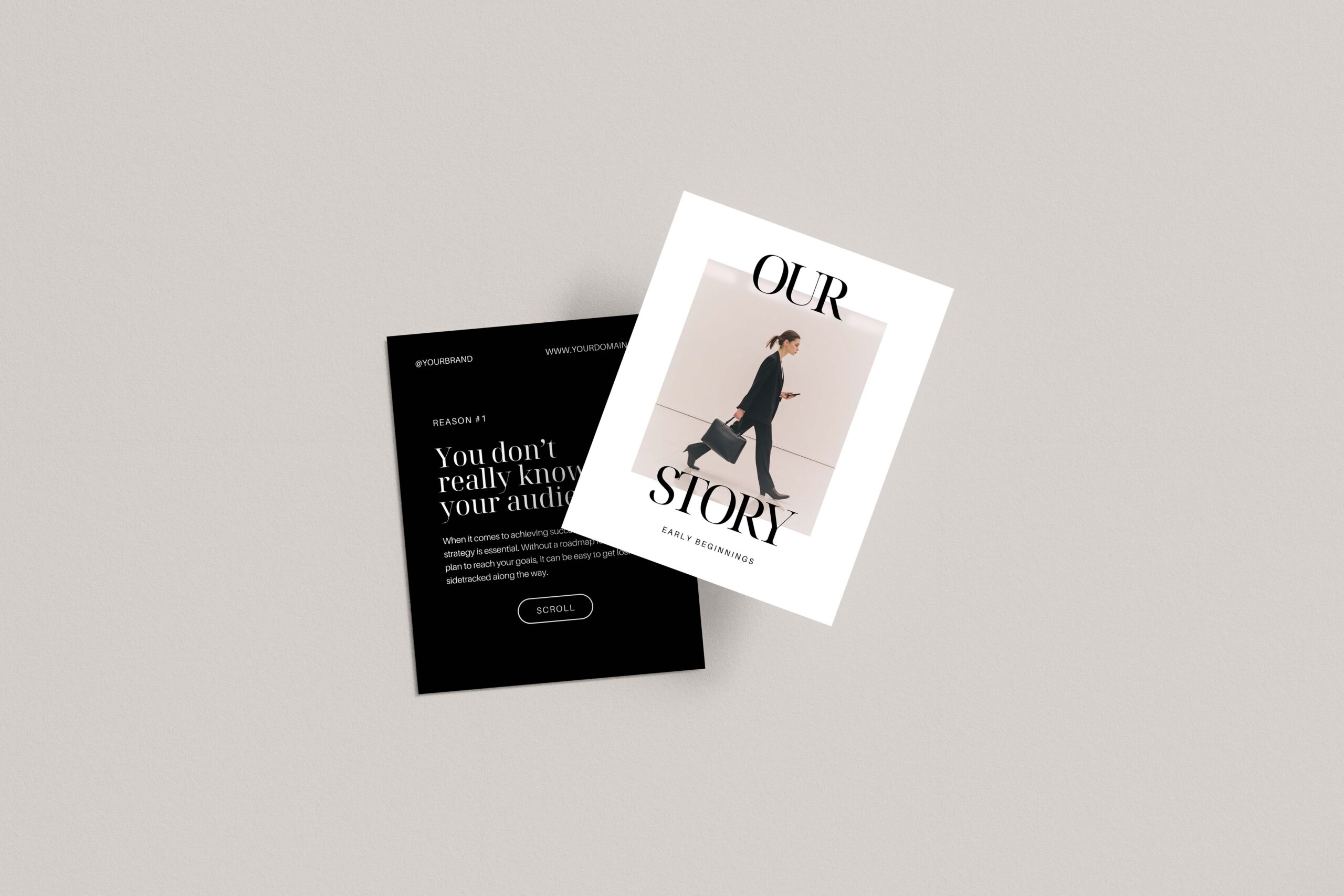
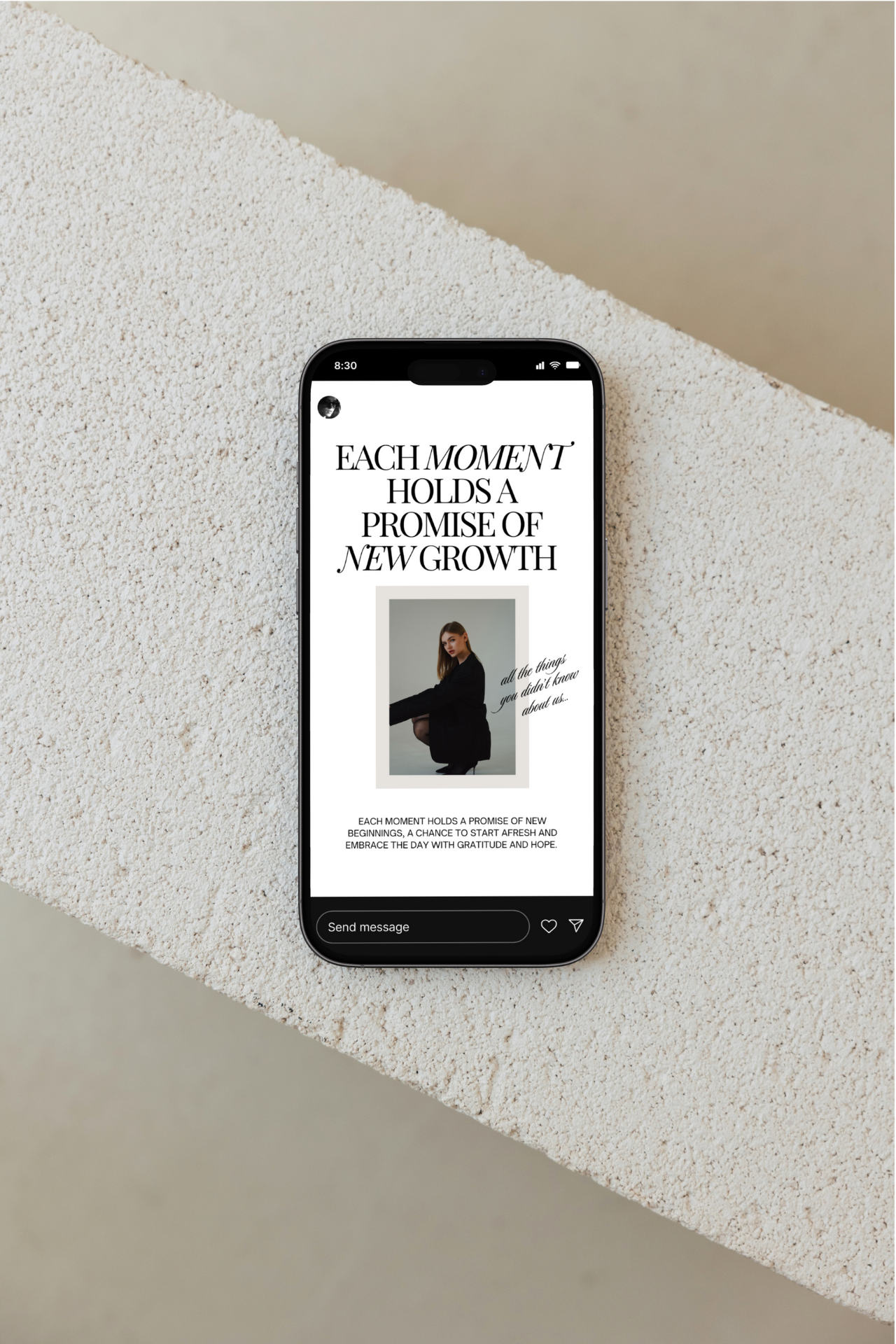
- Clear headline-driven slides.
- Structured content that is relatable and vulnerable.
- Educational carousels that guide the reader.
- Offer slides that feel intentional instead of salesy.
- Content that builds credibility through sharing stories.
- Cohesive layouts designs that support messaging.
I began figuring out how to implement those important pillars into a cohesive system that felt both functional and beautiful.
That system became Brooklyn.
Brooklyn is more than a pretty Canva template. It is a structured content framework with a design layer on top. Every layout inside the collection is built around real communication patterns that real brands have used who have one thing in common: they know their audience and they care about providing value to them.
With Brooklyn, the goal is not just to make your feed look elevated. The goal is to remove the stress of figuring out how to design a post, how to structure your words, and instead focus on the value you want to provide.
In the walkthrough video below, I take you inside the collection and show you how it works in real time.
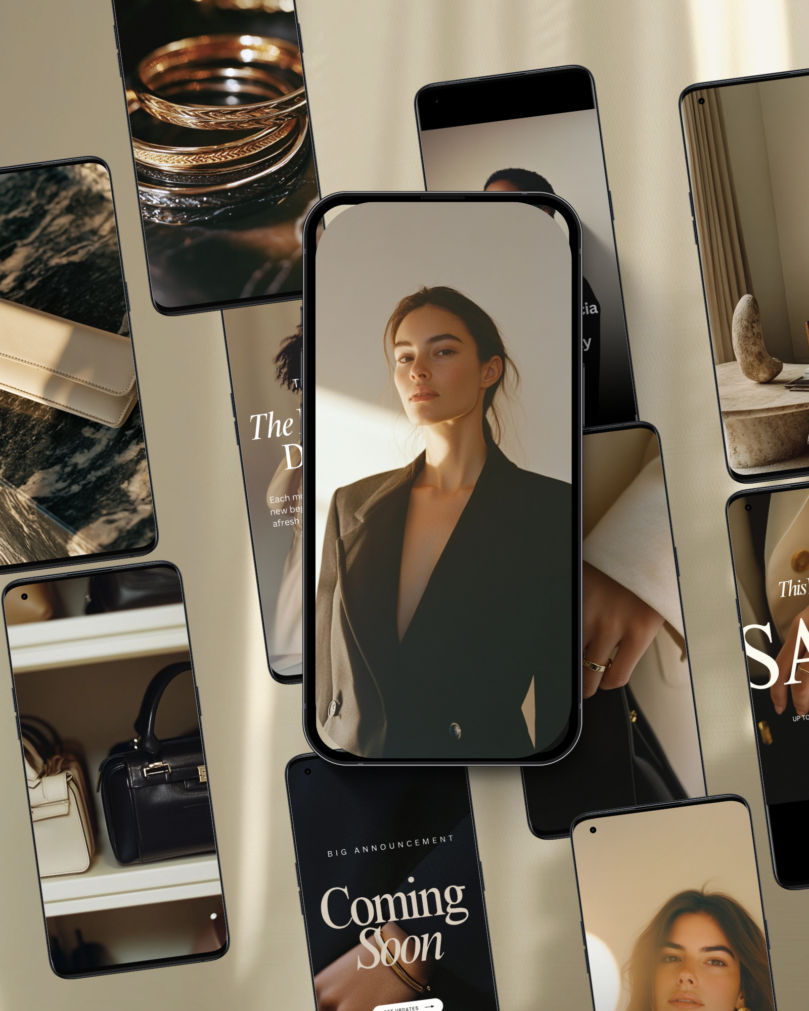
In the video, you will notice how quickly the slides adapt to whatever color, font, or photo preferences you choose. I update headings and show how easily you can clarify your positioning. Each layout supports communicating to your audience without overwhelming them. I tweak background colors so you can see how seamlessly it aligns with different brand palettes. I duplicate interior carousel slides to show how simple it is to expand on an idea without redesigning from scratch. I swap imagery using my Aurea stock collection to demonstrate how visuals can elevate tone while the structure remains intact.
As you can see, it’s not about using the latest design tricks or advanced tools. Brooklyn makes posting easier, so that you can develop an efficient system to show up consistently.
When the structure is already built for you, you stop staring at a blank screen. You stop overthinking spacing, hierarchy, and layout. You stop wondering whether your service explanation feels clear enough. The guesswork disappears because the framework is already there.
Instead of asking, “What should I post?” you start asking, “What do I want to say?”
Brooklyn was created to reduce friction, lower the mental load of content creation, and give you a repeatable system. You can mix and match slides, reuse layouts for different topics, and adapt them for launches, educational series, or promotional campaigns. The structure stays consistent, which means your audience begins to recognize your voice and your visual rhythm.
Design supports strategy. Strategy supports clarity. And clarity builds trust.
If posting on Instagram has felt stressful or inconsistent, this collection was built to solve that exact problem.
You can explore the full Brooklyn collection here and see how it fits into your content workflow.


If you want to elevate your graphic design game, enjoy talking about small business entrepreneurship, and appreciate a spark of inspiration mixed with authenticity...You've come to the right place.
Follow
Let's be social →
Join
Join the newsletter →